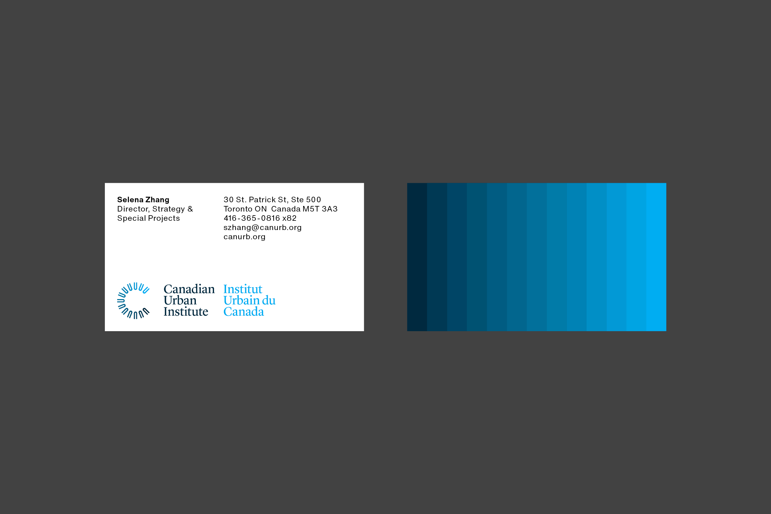
Canadian Urban Institute
Logo and design for the Canadian Urban Institute – a national organization that addresses key issues such as living, employment and the environment through an urban lens.
The 13 U’s in the logo represent Canada’s 13 provinces and territories. Each U is in a different shade of blue, representing its own unique urban opportunities and challenges. They are arranged in a large C (for Canada), but can also be thought of as a gathering circle where ideas are shared.
Sali Tabacchi also works with CUI on developing visual identities for ongoing initiatives.
Services
Branding, Document Design, Digital